

Today users engage with websites through a wide range of devices and therefore, a consistent user experience is highly desirable. Responsive web design (RWD) is at the head of this mission, making certain that any website can easily adjust to any screen size and resolution.
It becomes crucial when you want to go to the next level of understanding or receive profound technical advice on how to achieve the best results for your resource in various contexts and interfaces.
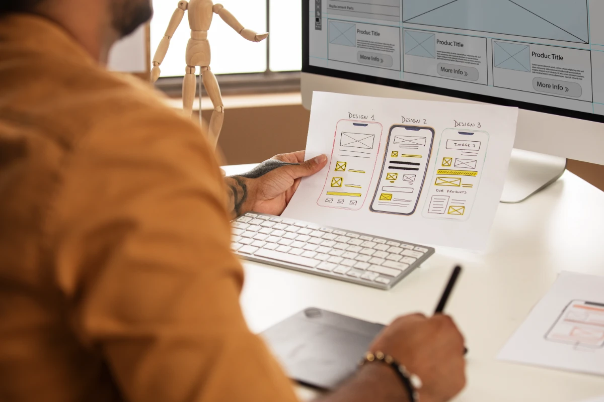
Working with a Website Development Company can be beneficial to your responsive design project, as it adds professional experience and knowledge to the development of a site that both looks good and functions correctly.
Starting with adaptable columns and rows, fluid images, and media queries, we will discuss all the concepts that will help you set up an impressive website that will look great on any platform chosen by a visitor.
Understanding Responsive Web Design
Responsive Web Design (RWD) is the practice of designing and/or developing Web pages with the flexibility to resize and reorient depending on the device being used to view the page.
The main aim is to make user interface and interaction across the devices familiar and understandable in order to work on the website. All this is done through the utilization of fluid grid layouts, responsive images as well as through media queries in cascading style sheets commonly referred to simply as CSS.